Measure Twice, Glare Once: What a Frame Actually Does to a Painting
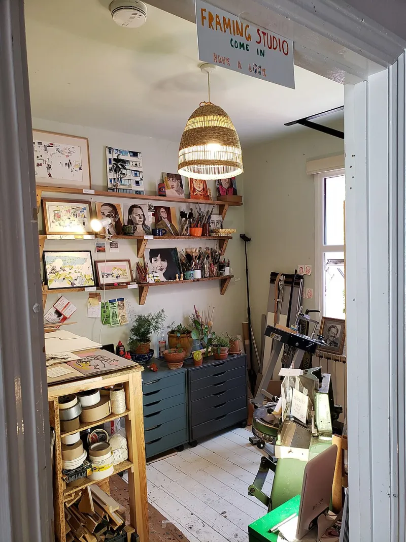
Photo: Andy Li, CC0, via Wikimedia Commons
Last February, against every instinct I pretend to have, I sent a four-thousand-dollar painting to a group exhibition in a forty-dollar ready-made frame. The deadline had compressed my judgment into a narrow corridor. The frame arrived two days before the courier did, and I remember thinking that black was black, that wood was wood, that a border was a border. The painting came back looking smaller, greener, and somehow apologetic. That is not a moral failure of inexpensive frames. It is evidence that a frame is an optical instrument. It changes what the eye receives before the mind has time to argue.
The Frame Is a Color Filter
A black moulding does not merely contain a painting. It lowers the volume of everything near it. A pale maple frame can make a cool sky appear warmer; a dark walnut frame can make a warm interior feel sealed and private. The same canvas, placed in two different frames, will report two different temperatures. This is not mysticism. It is adjacency. The eye reads the frame as part of the painting's field, and the painting obeys.
Glass matters just as much. Standard glass introduces a green cast that most viewers never name but always feel. Museum glass is not only a conservation expense; it is color management. In a room with windows, ordinary glass turns a painting into a mirror at the wrong hour. The artist who ignores glare has effectively allowed the room to finish the composition.
Proportion Before Ornament
The best lesson I received came from a custom frame shop in a strip mall, between a nail salon and a tax preparer. The owner did not ask me what style I liked. He asked what the painting was doing. Then he laid six mouldings across the canvas, one after another, and waited. A wide frame made a small study look officious. A thin frame made a large canvas look unfinished. What he taught me was proportion: a frame's width should be judged against the painting's shortest side, not against fashion. A two-inch frame on a six-inch study is a corset. A half-inch frame on a six-foot canvas is a whisper.
He also taught me that ornament is the last question, not the first. A frame can repeat a minor color in the painting, but it should not introduce a new character to the story. If the frame is louder than the work, the work has been accessorized rather than housed.
Mats, Glass, and the Cost of Clarity
Works on paper need air and separation. An acid-free mat of four-ply is a minimum for anything a collector expects to keep; eight-ply gives a drawing more room to breathe and a more deliberate shadow line. Bottom-weighting, the old practice of making the lower margin slightly deeper, is not a fussy tradition. It keeps the image from appearing to slide down the wall. A mat that is too narrow looks like a clerical error; a mat that is too wide can swallow a small work whole.
For oils and acrylics on canvas, glass is usually wrong. It flattens the surface and traps the very texture that justifies the medium. If glazing is necessary, use spacers so the glass never touches the paint. Acrylic glazing is lighter and safer for travel, but it scratches with a readiness that glass does not. For works on paper, UV-filtering glass is not an upsell. It is the difference between a document and a memory.
Hanging Height and the Body's Memory
Most American galleries hang at fifty-seven to sixty inches on center, a range derived from the average human eye. That standard is useful, but it is not a law. In a home, furniture changes the body's relationship to the wall. Above a sofa, a painting often needs to sit lower than the gallery rule; in a hallway, it may need to rise. The frame should meet the body before it meets the eye. If a viewer has to tilt the chin to enter the painting, the frame has already made a demand.
Lighting completes the frame's work. A frame that looks quiet in daylight can turn brassy under a warm bulb. A deep shadow box can become a cave at night. The practical test is simple: stand where a viewer will stand, at the hour when the room is most used, and ask whether the frame is helping the painting speak or asking it to repeat itself.
When the Frame Should Disappear
Some paintings need a frame that is almost an apology. A float frame can give a canvas edge without adding a period. A gallery wrap can be honest for a casual work, though it is not a substitute for conservation. The forty-dollar frame can be a perfectly serious choice if it is quiet, proportional, and color-neutral. The expensive frame can be a distraction if it is trying to prove something the painting has not asked it to prove.
Before any frame leaves the shop, I now run a short checklist. Does the frame repeat a minor color rather than compete with a major one? Does its width relate to the painting's shortest side? Does the glass cast a green or mirrored light at the hour the work will be seen? Does the mat give the image air without turning it into a document? At hanging height, does the frame vanish? If the answer to the last question is yes, the frame is doing its job. The painting has not been lost. It has been allowed to arrive.