Fifteen Airports, One Palette: Notes on How American Light Follows Me Home
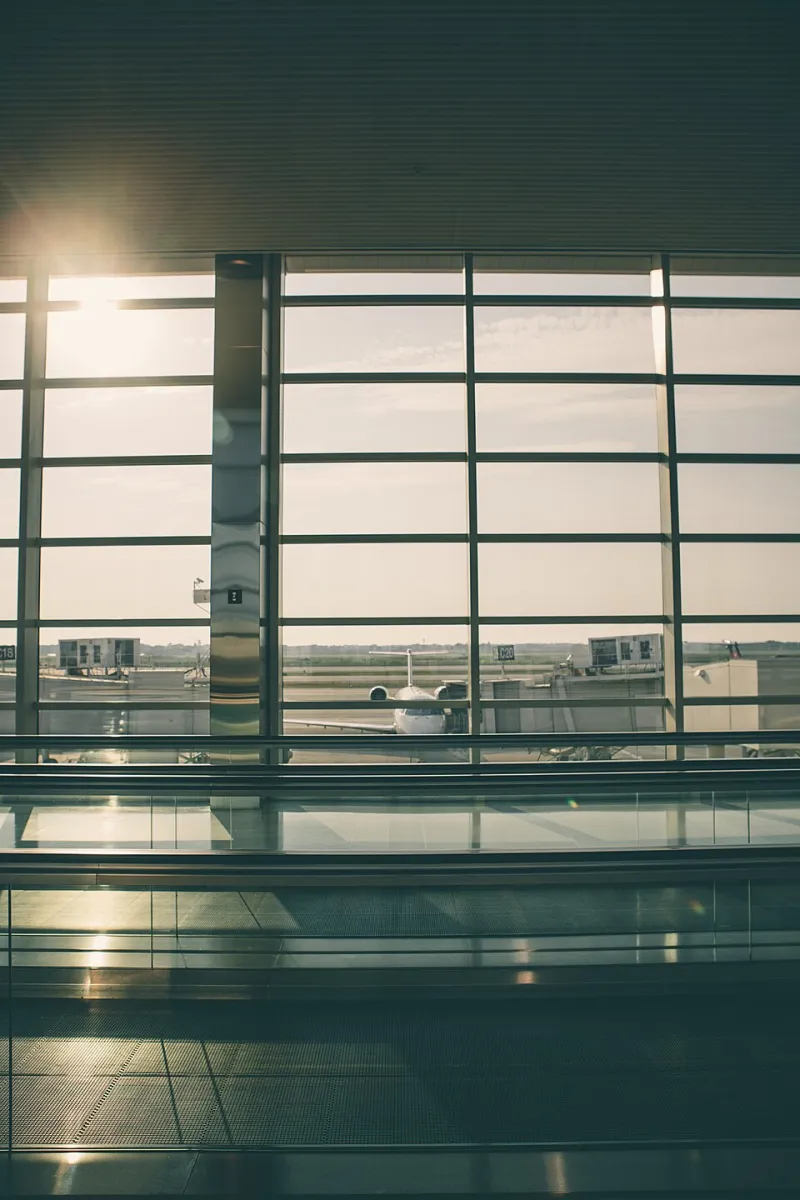
Photo: Matthew Smith whale, CC0, via Wikimedia Commons
The Layover as Unintended Residency
I did not set out to study American light. I set out to visit my sister in Portland, attend an opening in Chicago, and jury a student show in Texas. But travel compounds, and by the end of eighteen months I had passed through fifteen airports, and somewhere over the Rockies I noticed I was mixing colors I had never mixed before.
An airport is a strange kind of studio. You cannot leave, you cannot choose the light, and you are suspended between places — belonging to neither the city you left nor the one you are entering. It is precisely the condition in which the eye stops defending itself. I began keeping a pocket notebook of color notations the way other travelers keep boarding passes.
Concourse Neon and the Vegas Problem
Harry Reid International at midnight is a lesson in saturation taken past the point of reason. The slot machines, the signage, the light bouncing off terrazzo — everything insists. For weeks afterward, my reds were louder. I had to physically restrain my brush from reaching for cadmium the way a dieter restrains a hand at a buffet.
But something useful came home with me: an understanding that a painting can tolerate one truly loud note if everything around it consents to be quiet. Vegas taught me excess by overdose, which is sometimes the only way color theory sticks.
Pewter Skies and the Seattle Gray
Seattle-Tacoma in November is the opposite education. The light there is not gray in the way a paint tube called "gray" is gray. It is a warm, mineral, wet-stone color — closer to raw umber cut with white than anything cool. My first reaction was melancholy; my second was to realize I had been mixing my neutrals too cold for years.
Back in the studio, I rebuilt my entire gray scale around that memory. Every neutral I mix now has a whisper of warmth in it, and I trace that directly to three hours in a concourse watching rain streak the enormous glass.
Terracotta on the Tarmac
Santa Fe is the airport that felt least like an airport. The tarmac itself is the color of the place — that oxidized, ancient, dusty rose that the whole Southwest wears without apology. Stepping off the plane, my shoes gathered pigment. Literally. I have a small jar of New Mexico dust on my studio shelf, and I have ground a trace of it into exactly one painting.
What Santa Fe gave me was not a color but a relationship between color and ground. The sky there is so blue precisely because the earth is so red. Contrast is not decoration; it is geography.
Five Color Recipes Borrowed From American Cities
I keep these on an index card taped above my palette. They are not formulas so much as reminders of places.
- Las Vegas Red — Cadmium red light, untouched, with a fingernail of quinacridone magenta. Use once per painting, maximum.
- Seattle Neutral — Raw umber and titanium white, warmed with the smallest touch of yellow ochre. For shadows that feel like weather.
- Santa Fe Ground — Yellow ochre, burnt sienna, a breath of white. The color of soil that has been telling stories longer than we have.
- Chicago Vertical — Payne's gray over ultramarine, glazed. The color of lake wind on glass towers in February.
- New Orleans Humidity — Sap green mixed into every background wash, invisible alone, felt everywhere. The color of air you can wear.
What the Notebook Taught Me
Reading back through those airport notations, I see that I was never recording places. I was recording my own attention — proof that the eye is a traveler even when the body is standing still at Gate B14. Every painting I make now carries a layover in it somewhere. I have stopped trying to paint places and started trying to paint what places do to the hand that holds the brush.